Roast my art with me ('23 Mar)
Added 2023-04-15 15:00:04 +0000 UTCYou learn best from mistakes!
Maybe you know this feeling:
You just finished a beautiful piece of art and want to upload it proudly to the internet for everyone to see - but not even a few hours later and you see major mistakes that you didn't notice before! Instead of being sad and beaten down about it, try to analyze, acknowledge, remember and correct your mistakes from the past!
Caution! This might destroy a piece for you. At least for me it does. I cannot un-see mistakes once I noticed them!
Skip to the end for a summary.

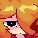
To be fair, "Zombie-Dabi" is somewhat difficult by himself because there are no good references because he's so burnt. Even if, some things wouldn't really make sense or wouldn't look good or appealing (as much as a half dead person could anyways haha!) like the eyelids or how much cheek is actually exposed.
I was going for the glowing effect that is pretty much just a stylistic choice by HK, but when for example adding small irsis, it would look super weird.
That's why I was struggling with the nose (again). In some manga panels it looks like it is burnt off (as it should be in his state!) but how much and what it's actually looking like is still not really clear. Same goes with exposed muscle/bone on his body.
If I could back on this piece, I would push the hairline a bit to the front and change the fire in the mouth area because it looks a bit "cartoony"
_____________

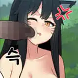
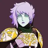
I don't draw Shigaraki as much and it definetely shows in his face! But then again, like with "Zombie-Dabi", Shigaraki is pretty inconsistent by himself. It doesn't matter if manga or anime, HK just can't decide how he wants to draw him haha! With Dabi (esp. Manga-Dabi) I kinda have a 3D picture in mind. But with Shigaraki - and his eyes especially - I struggle so much!
I really like his outfit when the war starts, but in this you barely see it anyways and the rest is drowned in shadows... O well.
_____________

I really like this! It's simple and it's not much going on imo, but I think the overall mood is really showing in this. The problem with how I personally work and color is just that some things won't be as noticable as I wanted them to be, in this case, the blood on his forehead and right side of his face. It's actually inspired by recent chapters, where he fights against AFO and is covered in blood - so no edge, only canon haha!
The hair seems a bit flat, but I don't know what went wrong here tbh. Maybe it's because the fur looks super detailed in comparision?
_____________

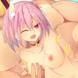
What I really regret about this is just how different it looks from the concept! Idk, sometimes I don't get Dabis face right (at least in my mind) and he looks really unfamiliar, like in this one. The Dabi in the concept was so much cuter? I guess it's because I drew the smile just a little too big tbh. Maybe the eyes are just a little too big. Maybe the nose is a bit too short? I feel like, nothing really looks right in here... BUT his chest haha! I really like the juicyness of his tiddies in here, even though they're not in the focus. O, and I love how I do the embroidery of his coat now! I mentioned it some time ago in my stories on IG that I changed the technique and wasn't really sure about it. Most of you said it looks better than before and now I am really digging it! If you want a detailed description/tutorial of the way I do it, just let me know!
_____________
What I am trying to improve in the future:
· noses (reoccuring theme I guess haha)
· more intriguing themes/poses/storytelling
What do you think?
Do you do this kind of analyzing with your old work? Do you agree with my problems?
I think it's important to just keep everything in mind to improve in your next drawing!