Roast my art with me ('23 Feb)
Added 2023-03-15 17:00:02 +0000 UTCYou learn best from mistakes!
Maybe you know this feeling:
You just finished a beautiful piece of art and want to upload it proudly to the internet for everyone to see - but not even a few hours later and you see major mistakes that you didn't notice before! Instead of being sad and beaten down about it, try to analyze, acknowledge, remember and correct your mistakes from the past!
Caution! This might destroy a piece for you. At least for me it does. I cannot un-see mistakes once I noticed them!
Skip to the end for a summary.


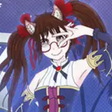
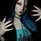
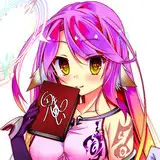
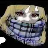
I really like this, even though it's "just" a redraw of a manga panel! I think the colors are gorgeous and I really did good on the overall light levels. But somehow the nose... the nose is throwing me off. Idk why I have so much problems with noses recently, maybe I am overreacting but they all look so... weird? I don't even know what's weird about them! Maybe you can tell me? Another things that bother me, but are easier to correct are the details I am not satisfied with. Hand veins are much bigger than how I've drawn them here - I was just not bold enough to make them chunky haha! The other thing that bothers me is his hand - while the one on his chin is super nice and detail-rich, the other one looks somewhat flat... I noticed this in other artworks already, but when I draw the hand from the side, with neither back of the hand or palm really visible, they're lacking too much detail and stand out. I really need to find a work around in the future!
_____________

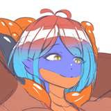
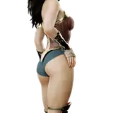
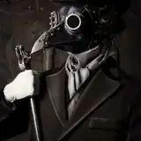
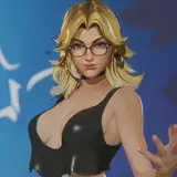
I'm honest, I am not really happy with this. A lot of things went wrong here in my opinion. So much, that I can't really show them in one summary, because they all tie into the image. While I love how I draw his belly, his entire torso and chest look a bit weird compared to other work I've done. But you can't really see it anyways because the light levels are an absolute mess! It's just too dark... I am really sad that I left out so many details too - after I finished it and made the WIP for Patreon, I notices I left out some details like a arm watch or rose petals. These are minor things, but I think they give the whole image a lot more depth...
_____________


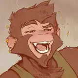
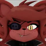
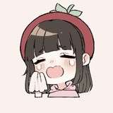
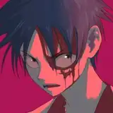
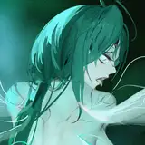
Another redraw, this time, from an old artwork! I really adore this and I only have minor critique to it (as of now). I noticed for some time now, that at first glance my characters sometimes look like they're cross eyed. They are not. But I guess sometimes I don't put the highlight in the right place and it looks like it. The sparks are an addition to the old artwork. I already changed how I draw them altogether, but I really wished I changed the direction a bit. See: my idea is, that he spreads his arms away - resulting the fire following his hands... but that should reflect in the sparks as well. Not only the sparks, but the steam too should be a bit more dynamic and be more adapted to his movements. The staples are a bit too bright/cartoony imo - I should've toned down the lighting a bit.
I already discussed his pants and lower half in the WIP and I still stand by it - I hope future-hoot will resolve this problem!
_____________
What I am trying to improve in the future:
· noses
· patience
· details
What do you think?
Do you do this kind of analyzing with your old work? Do you agree with my problems?
I think it's important to just keep everything in mind to improve in your next drawing!