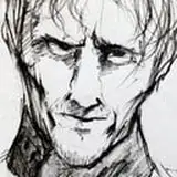
I attached all the steps to this drawing in the document. there are 40 stages
video process - https://www.patreon.com/posts/36938091
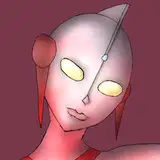
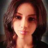
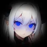
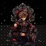
This time I decided that I would not make a clean line, but I would do the color under the sketch, there were not many layers on top, but I tried to make it atmospheric. I used the 3D base to understand the proportions of the characters and their approximate location, I believe that I made a mistake and it was necessary to first build the background, and then put the characters. because of this, the background took a decent time. in color, the most difficult thing was to disconnect two characters dressed in dark clothes. since I planned the evening, there was a difficulty, because there was no bright light and it was necessary to solve it on the nuances. to make the black details lighter, I applied a screen (screen) layer to the entire layer and when I made the light overlay, the light was visible and there was a feeling that it was black. when all the basic shadows and lights were done, I took the normal layer and made corrections with a simple brush. I compared every detail and asked myself questions - how light will fall on this plane, what color it is better to make this fold, whether it looks natural and if there is a sense of volume, I tried to make sure that all the folds do not break the shape of the body and character. Wildering guys taught me how to set and analyze every detail in work. it helps me do my job better, I analyze the material, it absorbs light or reflects and how bright it is, where it is better to make a different color for better understanding or how best to take it in depth.
I really hope that my thoughts were useful, and your questions will help me in the future to share my experience with you better
Rus - в этот раз я решилa что не буду делать чистую линию, а буду делать цвет под набросочной, было не так много слоев сверху, но я старался сделать атмосферно. я использовала 3д базу чтобы понять пропорции персонажей и примерное их расположение, я считаю что сделал ошибку и нужно было сначала построить фон, а потом ставить персонажей. из-за этого фон занял приличное время. в цвете самым трудным оказалось отклеивать двух персонажей одетых в темную одежду. так как я задумала вечер, то была трудность, потому что там не было яркого свет и нужно было решить это на нюансах. чтобы сделать черные детали светлее я накладывала слой скрин (экран) на весь слой и когда я делала свет оверлеем, то свет был виден и оставалось ощущение что это черный цвет. когда все базовые тени и свет были сделаны, я брал слой с нормалом и делал исправления простой кисточкой. я сравнивала каждую деталь и задавала себе вопросы - как будет падать свет на эту плоскость, какого цвета лучше сделать эту складку, натурально ли смотрится и есть ли ощущение объема, я старалась следить, чтобы все складки не ломали форму тела и персонажа. друзья Wildering научили меня задавать и анализировать каждую деталь в работе. это помогает мне делать мою работу лучше, я анализирую материал, поглощает он свет или отражает и как ярко, где лучше сделать другой цвет для большего понимания или как лучше увести в глубину.
Я очень надеюсь, что мои мысли были полезны, и ваши вопросы помогут мне в будущем лучше поделиться с вами своим опытом ^^
Tailz SnowMew
2020-05-09 18:03:28 +0000 UTC