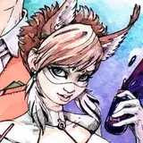
I've always wanted to make a film noir or rubber hose black and white cartoon - only not totally black and white. Mostly greyed colors with splashes of small bright colors. Here's a poster I designed for a cartoon Ralph Bakshi and I were developing in 1986. It's not as black and white as I ultimately wanted to do; it's more blue and white, but I sometimes get timid with color choices.

Lately I've been working on a caricatured painting of Minnie Mouse. I want to suggest a nostalgic feeling of early 30s black and white rubber hose cartoons without actually being pure black and white.

It's not finished yet but here is how I'm approaching it.
All these colors are mixed with greys to different degrees. If you looked at any of the colors in isolation they would look basically grey.
In the version below, the grey colors are mixed with a tiny bit of yellow (actually yellow/orange).

You can see that the color selection is almost all the way to the left side of the color selector. There is more grey than yellow.

The nose is just a darker version of the greyed yellow of the face.

Here's another version that also looks basically black and white but the greys are mixed with a little blue this time.


Here's a version with some areas using greyed yellow and some using greyed blue. The bluish grey bow now subtly contrasts with the yellowish grey face. It makes the greyed colors look a little more rich when you see the slight contrasts.

I can use greater contrasts if I want to draw attention to any part of the drawing. The blue bow has more color than the greyed yellow face and draws our eyes to it because of the stronger contrast.

Now I take the mouth area and use a greyed red to create more contrast to the greyed yellows and blues.


Below is the mouth with different degrees of how much color is mixed with the grey. The lips are almost pure red, while the tongue is closer to half grey, half red.
So now we have 2 types of contrasts going. 1) Contrasts of hues: yellow vs red vs blue. 2) Contrasts of saturation: (How much of a color is mixed with grey for different parts of the picture). The lips vs the tongue.

Now here is a subtle change to the nose. I've taken the greyed blue of the first nose and shifted the hue to between blue and purple - a greyed violet. I've also upped the saturation to make the nose a bit brighter.

Here I go back to the more greyed reddish mouth and it makes all the contrasts more subtle. At this stage I am just experimenting with the colors to see what effects different versions have on my eyeballs. I haven't decided on the final colors yet.
 I use the same approach to creating subtle colors for the body.

All the colors are mostly greyed but some have a little more color in them; Just a little more which creates just a little more contrast.
Btw, contrasts of many kinds and your conscious control of them are powerful tools for for creating bold and effective art. I'll do a post later about some of the different types of visual contrasts.

Next: Rendering in fake black and white.