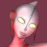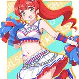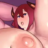
when I made the line, I made it a multiply property and painted the line so that it sits softer on the color base . when I start to make color, I make some subtle details on separate layers so that it is convenient to work with them. I hold and hold the ctrl and then click on the layer, this way I get the desired selected area with which it is convenient for me to work and not to touch neighboring parts. I make one not-so-transparent layer with one color in order to compose the colors of the whole character and help put it in the atmosphere, then one or two layers with shadows, one layer with light and then I work as normal, I corrects the moments that in my opinion need to be fix by color or tone. if you go too far with shadows or light layers, then the color will begin to give ugly color borders, to avoid this, I try to make many moment in normal.
To make the work more interesting, I try to come up with a specific incident light. I try to make sure that the shadows are on the right side. it helps viewers better understand where the light source is located and it better conveys the atmosphere.
to better understand how the light falls on the character's face - I open myself a hint. - https://www.artstation.com/artwork/GX3Ax1 or try to find a suitable example, where it is clear how the shadow or light goes
Do not be lazy to find a good example for each of your details in the work. it will be a little study, and it will also help not to make silly mistakes.
I often discover many examples with the right details. I will try to attach these examples in the video in the future if I make the video.
Orphen-Sirius
2020-05-01 10:48:03 +0000 UTC