
For me, painting a black and white drawing is still some new thing, but I will try to share the experience. I recorded a video and attached a file with layers for you so that you can see which layers I used for the effect.
In the beginning I painted the background, because it’s more convenient for me to make the character color when the background is already clear. I colorized it through layers with the effect of overlay and multipy. I planned the evening atmosphere and found some good examples of the sky for myself. I did not make it very late in the evening so that the character was not completely dark.. graffiti and the wall were the most difficult, for convenience - I had all the details in separate layers so that I could select and paint more accurately. I made layers at the beginning for each part and fixed them so that the color does not go beyond the boundaries of the area. I know guys for whom it is convenient to draw everything on one layer, but for me at the moment this method was convenient to create my own layer for each part. at the end I merged all the layers together and painted with the color I needed without effect. so that the file is not be heavy and does not freeze - I connected the background layers into one. I tried to make sure that the light on the wall and objects was warm. as opposed to warm light - the evening of the shadow I have a cold hue.
when the background satisfied me with its atmosphere - I switched to the character, now I had an idea of
what color to make light and shadow. the light should have an orange or yellow tint, and the shadow should have a cold blue or purple hue. just like the background, through the overlay and multiplay I made hue of light and shadow. to make the light more pleasant, in the beginning I made one layer of multiplication. because my character was already white in bright areas and the shade of the atmosphere was not visible. but now that the whole character was a little darker, the light areas could better convey the hue. in the end I corrected the moments that I didn’t like with a normal brush without effects
I began to make sure that all parts of my character were in the atmosphere and did not stick together in tone. the character’s ear was very close in tone to a piece of sky and I fixed it. sometimes in order to check the picture for contrasting areas - you need to make the whole picture black and white, this can be done by a filter in Photoshop. in this case, it will be better to understand which areas are very close in tone and can be visually poorly visible.
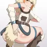
I attached for you my reference photos, which helped me in the process of drawing

I really hope that my words were useful to you at least a little. In any case, the video better explains my actions. layers and effects are visible there.
You can find a video with work on a black and white drawing and a black and white file in another post of mine - https://www.patreon.com/posts/b-w-work-with-36342949
RUS - я продублирую вышенаписанное на русском и немного своими словами)
Для меня удобней всего начинать с покраски фона, потому что, потом удобней сажать персонажа в атмосферу, когда понятно что какого цвета и света. Фон я расскрашивала через оверлей и мультиплай, но больше через оверлей. я прикрепила файл со слоями и там можно пощелкать, посмотреть какие слои я использовала и какие эффекты получаются при наложении тех или иных фонов. я не всегда использую свойство слоя на все 100 процентов, иногда мне удобней сделать несколько слоев с эффектом оверлея и при наложении они будут давать более богатый оттенок. самым трудным было граффити, но у меня была папка с отдельными частями граффити и покраска стала удобней, я сделала для каждого цвета свой слой и заблокировала его,чтобы цвет не выходил за границы. есть ребята, кто красят фоны на одном слое, для меня на данном этапе удобней работать вот таким образом, с множеством слоем. в конце я все-равно сливаю все слои в один или два, и крашу нормалом уже все остальные детали, которые мне непонравились по цвету или тону. так как я выбрал вечернюю обстановку, я старался сделать свет теплым а тени холодными и следить за этим. кроме того я открыл для себя примеры вечерних крыш где тоже было видно что свет больше оранжево-желтый а тени совсем холодные. я не нашел достойный пример вечерней зелени и старался просто следовать правилу - теплый свет, прохладные тени. в конце я все-равно немного утеплил градиентом все детали . кроме того. старалась следовать правилу что внизу света меньше и туда я старалась добавить больше градиента тени.
когда фон был готов я покрасила персонажа, тем же способом. через оверлей и мультиплай, светлые участки уже были белые и цветной оверлей не дал бы результата, поэтому сначала я сделала один слой умножения(мультиплай) и потом стала делать свет. это все есть в видео, плюс я старалась сохранить слои в процессе.
да, полезным советом еще будет - следить за тоном деталей в работе, чтобы они не сливались и не слипались, в одном моменте у меня склеилось ухо с куском неба, поэтому я постаралась исправить это. и чтобы проверять иногда работу на контрасты и на близкие по тону детали - в фотошопе есть фильтр -черно-белое. и можно сразу посмотреть какие детали немного склеились, не зря же в начале я сделала работу в черно-белом. и проверила чтобы ничего не сливало. выделять можно и цветом, но все-равно за тоном стоит следить)
вот) делитесь мыслями и это поможет мне в будущем делиться с вами своим опытом лучше.
Orphen-Sirius
2020-05-02 08:18:37 +0000 UTCOrphen-Sirius
2020-05-02 08:05:35 +0000 UTCOrphen-Sirius
2020-05-02 08:03:44 +0000 UTC