XXX4Fans
Meesh from patreon
Meesh

patreon


Business Casual | Page 21 | Process

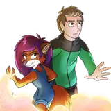
Many times when I make a rough for a page that has 3 or 4 panels, even if it's bombastic, I cross my arms and go "it just doesn't look like enough is happening...". 

I really wanted the sideways thrust pose to be in the center of the page, but then I pushed it to the left because it seemed to make more sense there, and I liked the overall composition. Then I had second thoughts about the last panel-- the first pose is a flat side-view, and the final panel is a flat front view, and I wanted to shake up the poses.

Then I felt like maybe just a bit more dialogue was needed out of Luis before he goes all the way inside, so I put him back in the center to give space for another panel. Then the final panel went through a couple iterations... Even the angle of the penis in the internal shot changed 4 times. Am I thinking too hard?

Business Casual | Page 21 | Process Business Casual | Page 21 | Process Business Casual | Page 21 | Process Business Casual | Page 21 | Process

Comments

I gotcha! The banter and casual back and forths do make it feel like a fun office setting. And the playful expressions (particularly from Vanessa) lend a nice comedic undertone :D Besides! Meeshy guts have made awesome stuff! <3

Ponpokora

I have tried to put a bit of comedy into the comic, but I see what you mean! I tend to second guess many of my choices, but have to trust that my gut instinct is correct.

Meesh

I like to think so! It's very easy to overthink the layout of a comic page, but I'm glad the effort is appreciated. :)

Meesh

These changes are a GREAT improvement for the overall tone of the comic :D The initial draft while impactful comes off a bit more comedic (like a rocket launch or choo choo train that 2nd panel) The anticipation built from the first panel with that wonderful line and the placement of those two in the middle with the internal shot of luis giving his all with vanessa having a blissful reaction &lt;333

Ponpokora

Rotating the angle in panel 2 really made the shot look more dynamic, and having the full body shot of the two in the middle ties the action together well. I think the page definitely benefited from the thought you put into this.

WDG

The 4th one should be the one without the word balloons..

RicanWolf


Related Creators