I've been dead busy all of September, so I haven't had the time to look at your submissions up until now - that's why I'm posting it this late.. 😅 Anyway, as you might have guessed already, I'm talking about the submissions and results from the 'Edit challenge' of September announced on this post. 😁
The rules were simple: 'You were all given five free raw-files of mine, from this photoshoot to process the way you felt the most'. 🤓🤌🏻🔥
So basically you were all given completely opportunities to edit just the way you wanted. 🤷🏻♂️🥳 Nothing is wrong - everything is absolutely right! 😁👏🏻
Even thou we didn't have thaaaat many submissions or participants this month, I think you've send in some super interesting stuff and the results are of great quality this time around! 👍🏻🥳
Patreon Supporter Ciao Bellezza!:


Three submissions kept in the same kind of toning, which I like. 😁💪🏻
You have used some sort of very destinct 'Skin retouch', which for some viewers miiiiight be slightly over done. Personally I think it would help if you added some 'grains' to the skin areas, when using this kind of skin retouch - but it's only my opinion. 😅
I miss some texture, you know. 🤌🏻
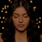
But let's talk about photo #2:
I like the way you've cropped it! It's really up close and personal. Can you explain a bit of the thoughts behind this choice? ☺️🤷🏻♂️ I mean; it's even more close up than my final photo, so I'm really curious to hear more about the reason you went this way. 🙌🏻
Photo #03:
Now this one is interesting I think, because a lot of things are going on here.. 👀 First thing first; you've nearly cleared out the whole background, added some blur to it and removed all the items. 👌🏻😁 I like the effort! 🙌🏻
It even seems like you've desaturated that whole area too, so only Trine is in colour and focus, am I right?
I would love to hear some of your thoughts behind this choice, because it really makes the photo differ from my original I have to say. 👏🏻
-----------------------------
Patreon Supporter Quinzin:


You ain't no stranger to these challenges and I love you keep on evolving and even challenge YOURSELF!! 💪🏻👏🏻😁
The first few times, it was clear to me that you were slowly getting the hang of the basics and did your best somehow, to "make the best photos possible without experimenting too much" - however, now times have changed. 🥳
You're much more playful these days and it's clear to me that you know what your doing (or at least got an idea of what some of the sliders and panels in Lightroom does 🤓🤌🏻) because your submissions are much more playful and experimental!! 🥳🙌🏻 I love this. 🔥
Let's take photo #01 for example:
You've obviously played around with the color of the models hair and you've even masked it out pretty well, I got to say. 👏🏻☺️
The red nuance in her skin has been increased a bit too, so it's a very colorful image actually.
You've managed to make her hair match the pillows, roses and the curtains. 😁👩🎤
Photo #02 is a bit more straight forward and I haven't got that many notes on that one, other than it's pretty cool. 😁
Again on photo #03 you've increased the density of the colours (especially in her eyes!) which makes them 'stand out' a bit. 👌🏻
The cropping on this one tho, is a bit interesting. Can you explain why you went with this ratio instead of the original one? 😁🤷🏻♂️
And last but not least, photo #04! 😁 You've somehow managed to hit the style of 30s horror movies, with the very grainy black and white conversion.. 😆🙈
It's a really interesting design choice which you're more than welcome to explain. I didn't thought of going black and white back when I shot the photo, but maybe you've been inspired of the 'analogue vibe' I mentioned?? 😅
-----------------------------
'Patreon Supporter Daniel Evaldsson:


All your four submission has something in common; You've went for a slightly more desaturated and cooler look. 😁👌🏻
It's interesting to me, since it somehow conflicts with the thought of someone walking around in lingerie - but I like to be challenged and would love to hear your thoughts behind this process, if you please? ☺️
Which program did you use? And did you achieve this only by lowering the White Balance or did you adjust other sliders as well?
I can't see no distinctive skin retouch, so I assume that you haven't done so much on that part, right?
-----------------------------
Thanks for participating in this fun little game. ☺️ There will be many more in the future, so stay tuned, since the raw-files are timed exclusives for PREMIUM*. (*Afterwards they are only available for Tier 3 supporters)
To all of you who wrote me telling that you were worried of others looking at your submissions; Don't be. ☺️🖤 It's super fine to be totally new in the game and just using this as a practice to get better, due to the feedback. That's what this is all about. ☺️
NEXT CHALLENGE WILL BE ANNOUNCED SOON but due to some very busy times for me, we either skip October or just begin halfway through or something.. 😅 I'm sorry.
Just stay tuned, info will drop ASAP. 🙏🏻
All submissions shall be send to: mikkel.laumann@gmail.com
Now, let me know in a comment what you think about all the wonderful submissions or maybe get inspired to join for the next round! 🥳👇🏻
Mikkel Laumann
2023-10-04 07:05:21 +0000 UTCTony Avellino
2023-10-03 20:24:16 +0000 UTCMikkel Laumann
2023-10-02 12:04:05 +0000 UTCTony Avellino
2023-10-01 20:54:11 +0000 UTCTony Avellino
2023-10-01 20:50:17 +0000 UTCMikkel Laumann
2023-10-01 06:16:42 +0000 UTCDaniel Evaldsson
2023-09-30 19:27:16 +0000 UTC