Welcome to the Timelapse video again~
Although this was a character design month, apparently I'll also have to talk a bit about the background this time. But let's start from the character first
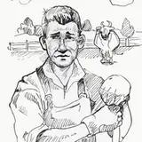
As I mentioned before, the Director's design is based on my previous avatar, which is a man with extra mechanical limbs and the overall design is a combination of cat and spider theme. But this time, I want him to look more formal due to his position in Archive. The clothing is designed based on a design for the Archive administrator staff's uniform, but I add an element that resembles the 'blacksmith apron' at the front. I kept the color pallet simple, 4 colors, the primary one is dark brown, the secondary is ivory white, and the accent would be gold and cinnamon brown. I use brown and gold to give it a sprinkle of steampunk feels, but I don't want it to go full steampunk, that's why I keep it as the accent instead of the primary and secondary.
The mechanical construct is designed based on a spider's abdomen, thorax, and limbs. Unlike the previous version, I designed it to be more versatile and actually looks functional. The previous version doesn't seem to be that functional because the arm can barely reach to many different areas. But this time, I made it so that it can spin and rotate freely to position itself... although it ends up looks creepier when it detaches itself...
The background depicted the non-restricted section of Archive (which technically managed by Kroma Grand Library). I use a simple one-point perspective since I don't want to distort the character too much, and in order to make my life a bit easier, I intentionally make it symmetrical. Therefore, I can just work on the left and copy-paste it to the right, which you can see in the video (01:58). BUT, I don't want it to looks like a straight copy-paste, that's why I still doing the details and ink-blocking manually. Plus, I tilt the camera a bit to create a dutch angle. This way it'll still have an asymmetrical feeling to it.
There are a few crucial factors that I always remember when creating DEPTH for a perspective like this; REPETITION and SIZE REFERENCE.
REPETITION - To repeat a certain object and place it at a different distance in order to create a sense of distance and perspective. For this artwork, it was the pillars and the bookcase.
SIZE REFERENCE - To create or add something that the audience can use to measure the actual height of objects in the background and place it at different distances. The object has to be something that the audience is familiar with so that they intuitively know how high that object should be. In this case, it is the reason why I have to add people to that artwork. The railing on the second floor also serves as this size reference, because we're surely familiar with how high a railing usually is.
I guess that's what I can share for this artwork, let me know if you have any question.
Cheers!