XXX4Fans
egscomics from patreon
egscomics

patreon


Two Character Alternate Shadow Version

Original version


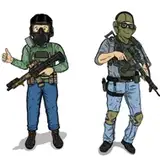
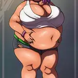
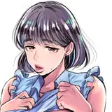
It occurred to me that, given how I'd set up the layers, there was nothing preventing me from making a version without the experimental gradient shadows on the characters.

So I did. And now I'm posting it (as a separate post so people won't miss it).

Incidentally, I'll be making this visible to everyone at the same time I make the original one, as I see no real point in putting that off under the circumstances. 

Two Character Alternate Shadow Version Two Character Alternate Shadow Version

Comments

A good job on both of the pictures, but I think the solid shadows just have more pop with your usual bold colors.

Kyman201

I definitely prefer the solid shadows over the gradients, aesthetically. That said, I kind of find something about Nanase's face... off-putting? Not sure if it's the lipstick or the facial expression, but I can't help thinking that something more akin to the second-to-last panel of "Family Tree" would work better. (Maybe I just find a confident smirk more attractive than... I guess you could call it a doll-like expression?)

M Berntson

Yeah, I couldn't quite put my finger on why, but I think the gradient shadows don't look quite as good with your style. With thick outlines and mostly solid colors, gradient effects look a bit out of place outside of action sequences with motion blur. (Not an expert by any stretch, just my two cents)

Daniel Mayer

I like both just fine, really. But in either case, thanks!

McZed

The skin of Fox really stood out to me in the first one. It looked to dusky. Not a color of living flesh. Like a colored photo that someone had just began to try to shade it in photo shop to look like those tan photos that people make imitating the old west.

Doomed

I'm finding myself liking this one better, too, and I'm not sure why. Huh.

Dan Shive

This is superior in my eyes, at least. Thanks for posting both versions!

Doomed


Related Creators