XXX4Fans
egscomics from patreon
egscomics

patreon


Color Experiment

This boils down to me wanting to know how this looks to people, so please forgive the incoming technobabble:

I've been creating a custom swatch library designed around making it easier to choose colors by dividing them up into 90 sets of hue bases with 390 colors each of varying saturation and brightness (there is a mix of automation and manual effort required to make it, hence why it's still an "in progress" thing).

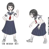
(As an example, Nanase's pants and gloves/boots are different colors from the same hue set of swatches)

My experiment here was character color palettes over a background, and how to make the shadows work in a way that doesn't take CENTURIES. Basically, I went with a simple black 30% opacity layer, and a duplicate layer that instead just SLIGHTLY ups the saturation of the shadows.

I was hoping to get away with just one shadow layer, but I wasn't happy with any of the results from that.

Color Experiment

Comments

So, if this new coloring pattern (which looks very good, by the way) doesn't take CENTURIES anymore, is it down to decades? Or just years?

Jacob Barboza

IMO, this looks as good as or better than any other page you've colored.

David Olie

This looks bright and cool! More "lively" somehow than your previous colors I think? I just went through the comic at random to find some old coloring, and landed on The Trials of Susan. This version looks more realistic (I think due to shadows) and energetic compared to that :)

Amanda K

I think this is just as good as your colors have been in the past. It maintains the uniqueness of your colors that I can’t describe. (Something to do with more energy in the cooler tones somehow?)

Prof Sai

I'm not sure then. Does this mean the test was a partial success? Doesn't sound like a complete success...

John Trauger

Looks good to me!

coredumperror

I don't know if this is a result of your new swatch library or just the colors you happened to choose, but the general look of the strip feels both brighter and paler than your usual work (if that makes sense). It feels strange right now, but I think I'd get used to it. As for the shadows, the change might be contributing to the odd feel I'm getting, but just considering them on their own merits they look pretty good.

Chronos Cat

I think it looks really good. :) Sorry I don't know enough about color to say more than that, but it's nifty to see the strip in color again.

M.

It doesn't make them take MUCH longer unless there's a lot of gradients, or if I miss spots the first time around. Relatively speaking, it's a minor increase in time commitment.

Dan Shive

Does this at least make shadows take decades instead of centuries?

John Trauger

I dig it

Sam Mann

That looks pretty good, unless I compare it too closely with Dave Barrack's post right below this one. I think that guy either gets more hours than I do per day or he has a team or something.

Some Ed

Not as one layer.

Dan Shive

Me not knowing a lot about color: Instead of mixing with black, could you have a single layer that reduces value by some percent while simultaneously upping saturation?

Wolf Avatar

I agree with the others. This looks really good. I can't really imagine what it looked like without the extra saturation on the shadows, but the shadows look really nice.

Wolf Avatar

This looks pretty damn good, IMO.

Kyman201

I like the colors a whole lot. As David says above, your art looks great in color. I particularly like Sarah's color palette, her hair and clothes have a nice variety that match well.

I like it, Sarah looks super cute.

Scotty

I think it looks good, always been a fan of how you do color in your art


Related Creators