Stitching a Story: From Threads of Inspiration to the Cover That Ties It All Together
Added 2025-02-08 14:17:42 +0000 UTC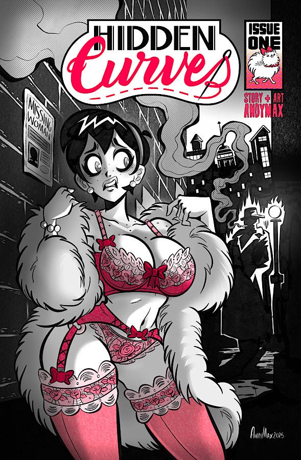
The idea for my newest comic, Hidden Curves, came from an unexpected conversation. My wife, Felicia, was voicing her struggle to find a bra that fit her proportions—something comfortable that made her feel beautiful.
Being slim, she couldn’t find off-the-rack pieces with a band small enough to fit her frame while still holding everything else in place. We joked about her learning to sew so she could make her own alterations, and that’s when I thought: There’s a story here.
At the time, I finished my first comic, Cargo #1-2, the first two chapters of a post-apocalyptic trucker story. It was gritty and intense, with themes of loss and survival in a dystopian world. Between writing chapters, I’d been cleansing my creative palate with classics like The Apartment, The Godfather, and Casablanca—stories set in an era when America felt like it was on an upward trajectory. I’d also been diving into retro-styled works like Mad Men, Tracy Butler’s beautifully illustrated Lackadaisy, and the noir masterpieces Blacksad, and Sin City.
I’ve always loved retro aesthetics—artists like Darwyn Cooke, Bruce Timm, and Shane Glines are huge inspirations. I wanted to combine that timeless, vintage noir look with the playful energy of pin-up art.
Cover for Darwyn Cooke’s Spirit #12.
Shane Glines is a master at simplified line and gesture.
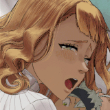
At the same time, I wanted the story to tackle real issues women face with their bodies, their ambitions, and their insecurities, especially in that era. That’s when the idea for Hidden Curves clicked: a lighthearted noir about a shy & curvaceous, Betty Boop-esque seamstress named Viola Delaine, navigating a crime mystery in a gritty 1940s city — all while trying to sew the perfect bra.
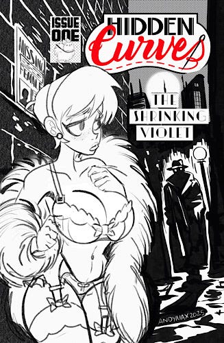
Let’s take a look at how I designed the cover for the first issue, which solidified the visual identity of the comic…
One early iteration of the cover.
Creating comic covers is always a tricky balancing act. A cover is often the first impression, and people really do judge books by them. It needs to grab attention as a piece of artwork while also conveying the essence of the story to draw the right audience.
For my previous book, Cargo, I chose a European album format because I loved the wider canvas for illustrations. But readers pointed out that the larger 9x11 size made it tough to store on a rack — and it certainly wasn’t fitting in a longbox. So, for Hidden Curves, I committed to working within the standard American format—taller and thinner proportions, a change that brought new challenges to composition and design.
To get inspiration, I studied a wide range of comic covers, from successful indie projects on Kickstarter to iconic classics. One that stood out was a sketch for Bruce Timm & Paul Dini’s Mad Love, a comic book introducing Harley Quinn.
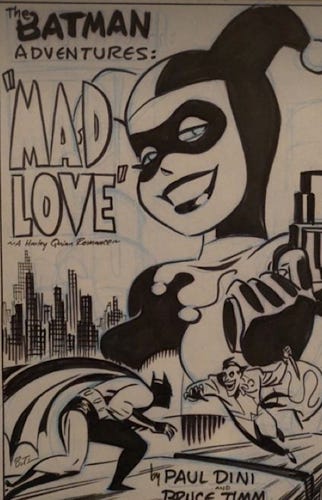
Art by Bruce Timm.
It’s a masterclass in fun, cartoonish storytelling that still veers into darker territory. What I admire most about Timm’s art is how it uses simple, bold shapes and clever composition instead of relying on extreme detail.
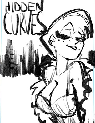
First sketch.
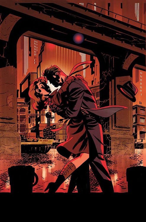
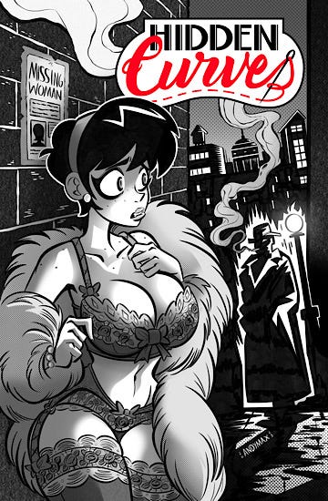
My first concept was a close-up of Viola against the silhouetted cityscape of Chromopolis, refining the idea by pulling the camera farther out to better showcase the noir city streets, filled with smoke and a shadowy figure in a trench coat. The initial sketch had dynamism, but something about the anatomy felt unnatural.
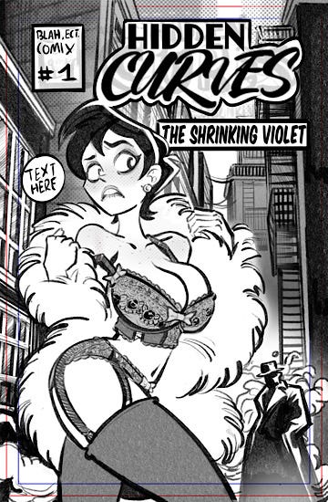

Some alternative designs.
A second iteration incorporated a tilted angle to the city skyline, Sin City-style bricks, and a different pose for Viola, but while the background leaned further into the noir aesthetic, the pose lacked focus and energy. Neither version was quite right.
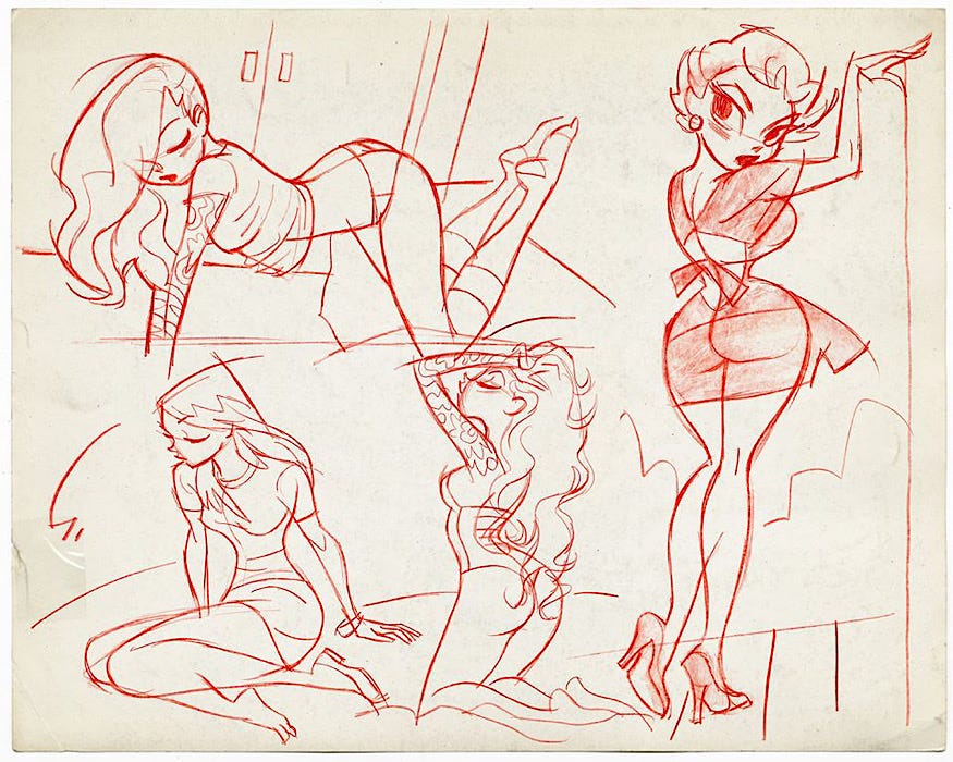
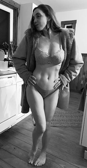
During this design process, Felicia donned a lace ensemble and a big coat, and we did a photoshoot to nail down the anatomy and pose. Using the reference, I continued to practice my figure drawing and shading.
I combined elements from the two sketches: the dynamic energy of the first with the refined noir atmosphere of the second. The result felt like it finally captured my vision.
The final touch came from Frank Miller’s Sin City. Miller’s use of spot coloring to emphasize characters or objects inspired me to add a similar effect. Viola’s lingerie—an expression of her creativity—would stand out as colorful and controversial in the black-and-white noir world.
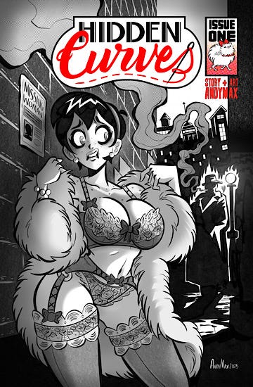
Each new piece with its own signature color, starting with pink for her first design, symbolizing her hidden femininity.
The reception to the pink cover has been positive. It’s given the book a unique identity and drawn readers to the project. With the cover completed, the next step is diving into the interior pages. But before that, I’ll be detailing the creation of the cast of Hidden Curves in my next article.
Thanks for reading! Stick around for more behind-the-scenes insights!
Comments
A little bit of both. If the cups fit, the band was too big. If the band fit, the cups were too small she eventually found a size that worked for her, but it’s not perfect.
Andrew Rodriguez
2025-09-17 14:26:44 +0000 UTCWas problem your wife was having was it bra too big or bra too small?
GundamNate2025
2025-09-17 13:06:59 +0000 UTCShes quite the muse!
Andrew Rodriguez
2025-08-17 15:14:45 +0000 UTCI must say Felicia is sporting some great curvs
GundamNate2025
2025-08-17 06:22:11 +0000 UTC